Fudtraka-Restaurant Discovery & Ordering MVP
Product design

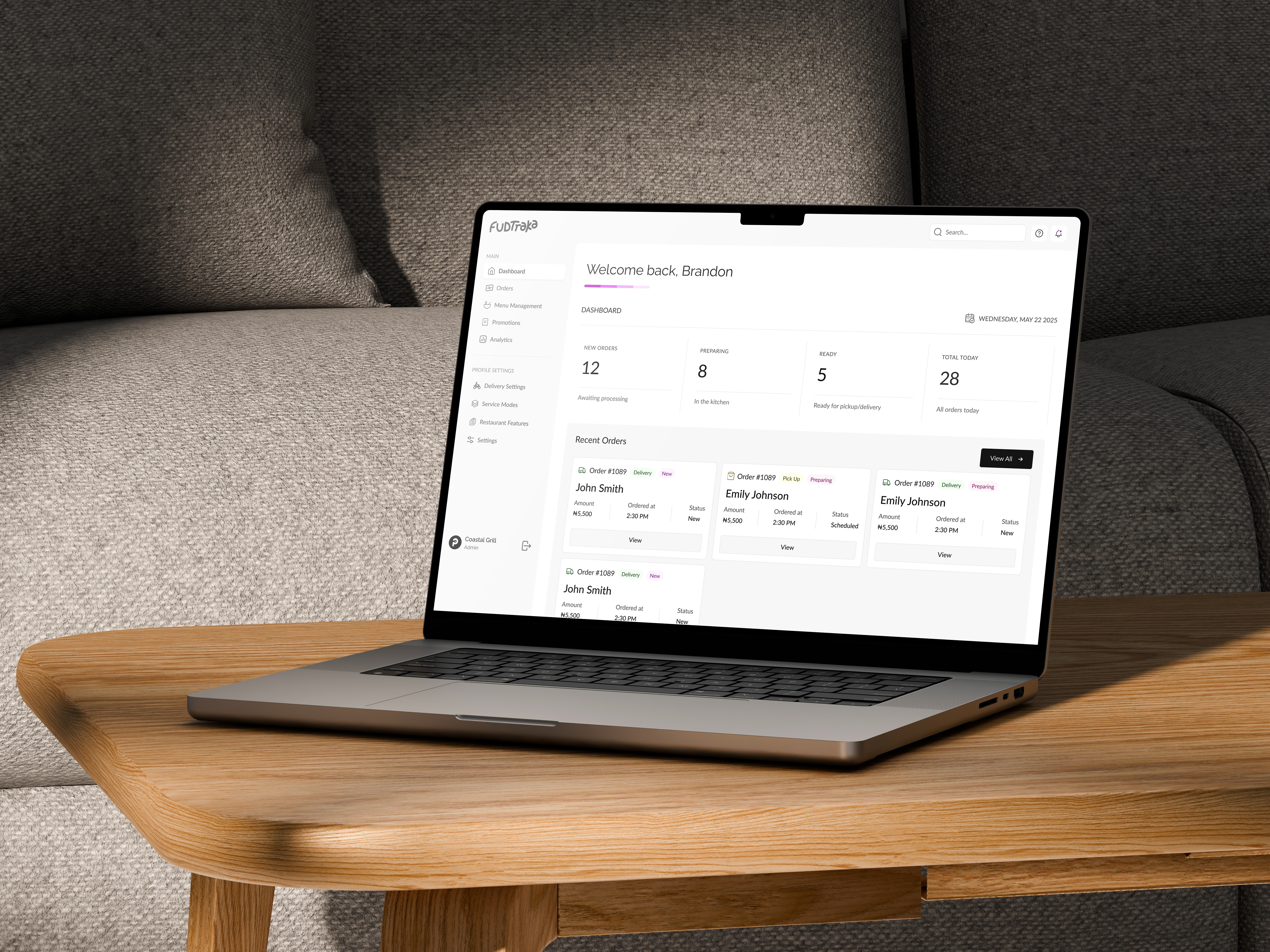
About the project
Challenge. Help a food-tech start-up go from concept to clickable prototype so they could validate product-market fit and secure funding.
My role. Built the IA, user flows and high-fidelity UI in Figma; conducted weekly customer interviews; iterated on information architecture and micro-interactions; wrapped the work in a narrated prototype for stakeholder demos.
Outcome. Prototype aligned founders and engineering on scope, cut dev rework risk.
Client
Fudtraka
Services
Product design
Year
2025
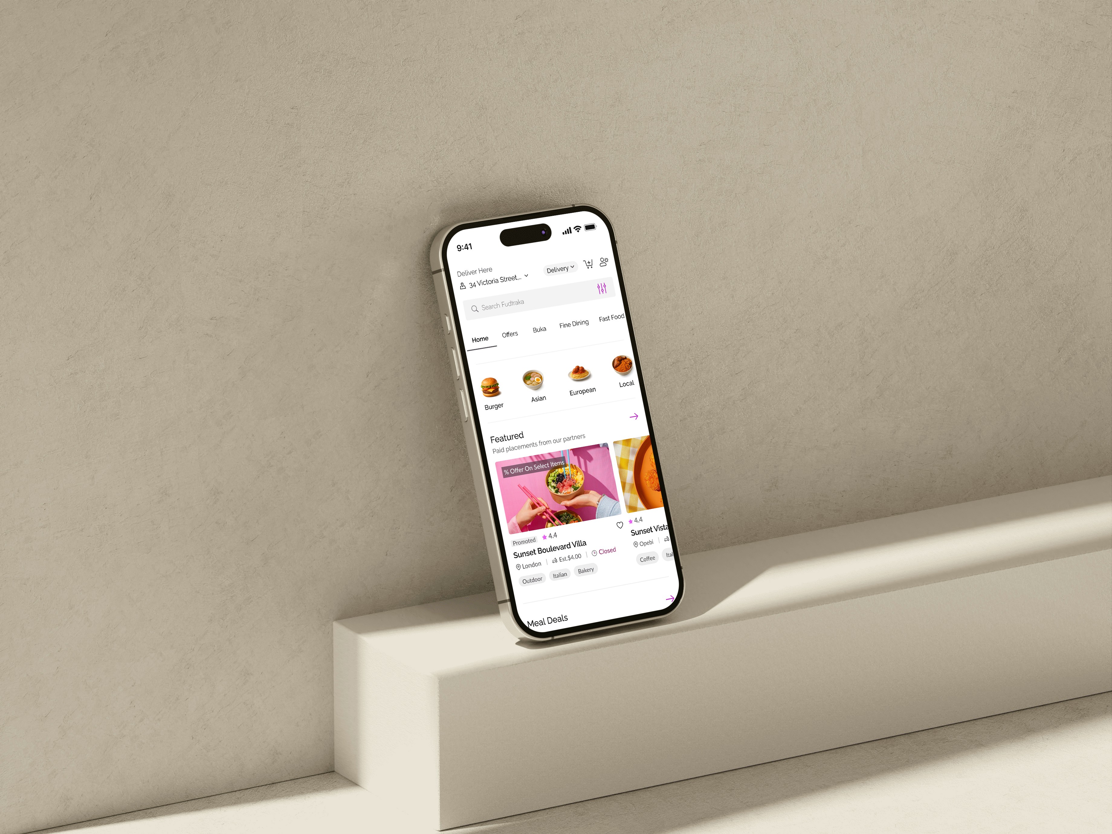

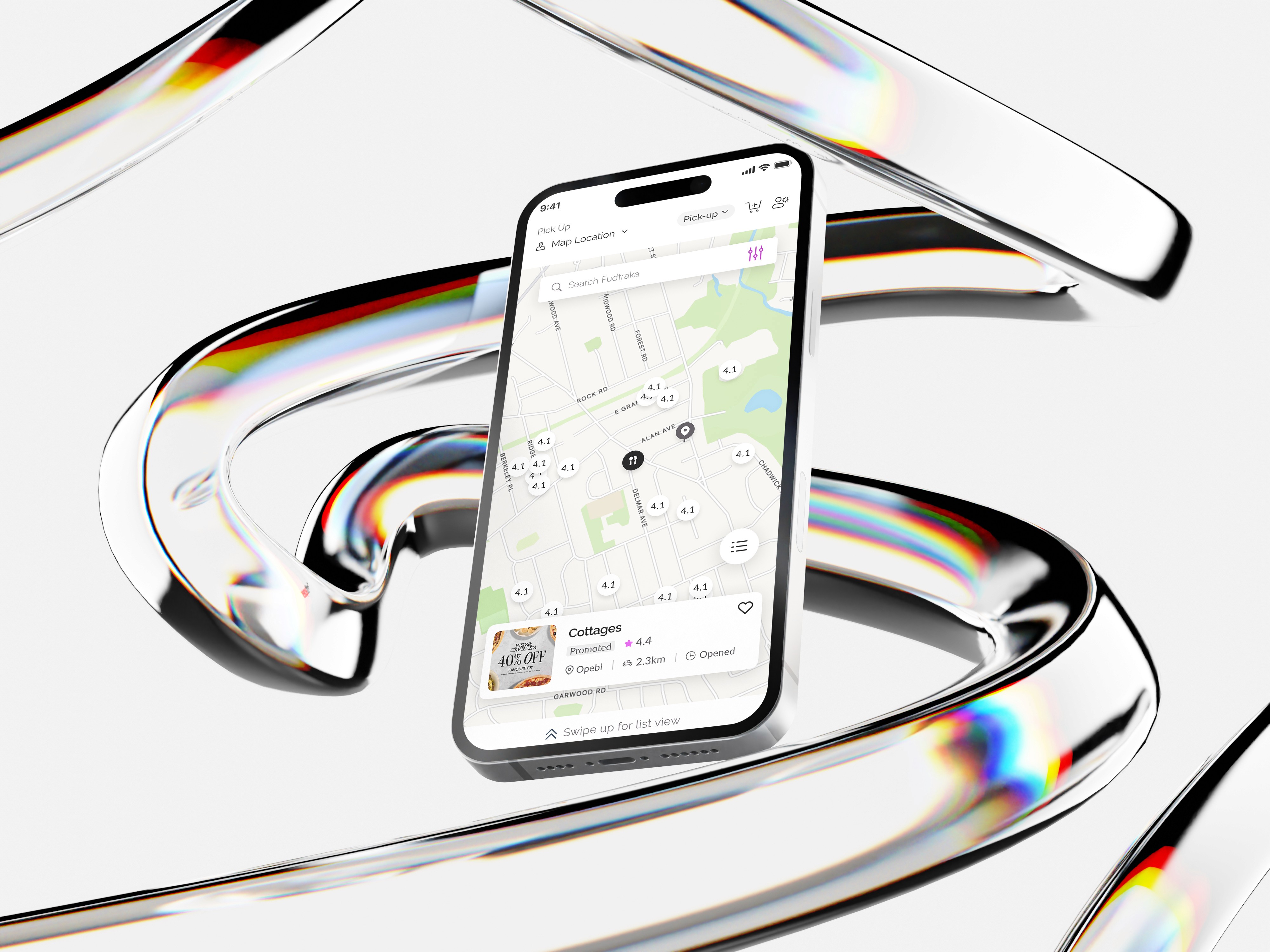
Fudtraka helps people discover and order food from local restaurants with a focus on simplicity and ease. The team wanted an MVP that was straightforward, easy to navigate, and quick to understand — without overwhelming first-time users.
I led the end-to-end design process as the product designer.
Defined the product vision with founders and engineering, ensuring alignment from day one.
Led weekly design critiques and alignment sessions to maintain quality and focus.
Built a reusable Figma component library to speed up future design and dev work.
Facilitated user interviews and turned insights into actionable improvements.
The Problem
Food delivery apps often feel cluttered, with too many steps and options that confuse users. Our research revealed:
Users wanted a simple way to browse menus and place orders quickly.
Many dropped off during dish customization because the process felt overwhelming.
Interviewed 8 potential users to understand needs and expectations. Created user journey maps to identify friction points.. Conducted competitor analysis to learn from common UX pitfalls in apps like Bolt Food and Uber Eats.